Outdoor LED Screens | How To Deal With Harsh Environments

A group of people gathered in front of an LED screen, engrossed in watching the content displayed. The LED screen emits bright, vibrant colors, captivating the attention of the viewers.

Large-scale LED screens are a great way to make an event pop. Brighter and less finicky than a conventional projector screen and more dynamic than a static sign… An LED screen adds versatility to any event as well as a significant “wow” factor. But if you’ve ever attended or put on an outdoor event, you know there’s one thing that can put any piece of event equipment at risk: the weather. Rain can ruin delicate electronics and merchandise, wind can blow over tends and barricades, and hail can damage even the toughest gear—to say nothing of the dangers of lightning!

At first glance, one might think that an outdoor installation of an LED screen is asking for trouble if there’s any weather in the forecast. After all, your average home TV isn’t exactly something you’d want to leave out in the rain! However, many modern LED screens available on the market have the ability to withstand harrowing storms without issue. But how are LED screens weatherproofed and how can you tell what screens are safe to use outdoors? Let’s have a look.

IP ratings chart illustrating degrees of protection provided by enclosures against intrusion of solid objects and water. The chart categorizes IP ratings from IP00 to IP68, detailing varying levels of protection against dust and water ingress. Each rating is represented with corresponding descriptions and diagrams, aiding in understanding the degree of protection offered by each enclosure against environmental factors.
IP Ratings Charts

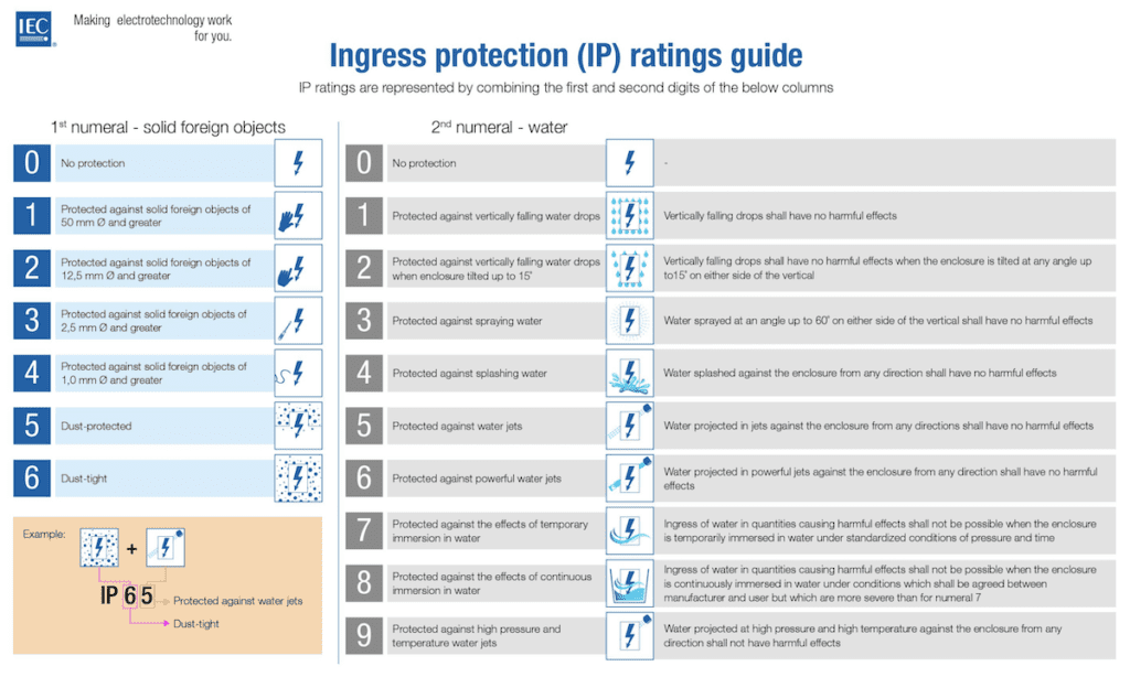
Have you ever seen a product being advertised or labeled with an “IP rating” for weatherproofing—such as IP45 or IPX2? What does this mean? In simplest terms, this code is an international standard for dust and water protection ratings for electrical equipment. A higher first digit means a higher protection rating against dust and solid objects, whereas a higher second digit means higher water resistance. Have a look at the specific meanings!

It’s pretty interesting that there’s a code rating that covers ingress by someone’s fingers! So what does this mean in the context of weatherproofing LED screens? Well, the LED panels we use are rated IP65. As you can see, that effectively means that no dust is ever a danger for the operation of the panels. And the LED modules, panels, and connectors are all rated against a strong spray of water. In fact, if the panels get dusty or dirty, you could just clean them off with a hose! So for the panels themselves, you have plenty of leeway to leave your screen set up in rough weather.

However, there’s a catch. While the panels themselves may have a very high weather rating… it’s not guaranteed that everything else in your workflow can stand up to the same rigors! For example, most video processors and controllers that interface with outdoor LED panels don’t even have an IP rating. While it’s likely that they can withstand some weather, it’s not something you want to bank on. If your entire installation is outside, make sure your controller is under good cover when there’s rain on the forecast!

This dovetails into our next point. While it’s easy to focus on the LED panels themselves when weather is on the way, as they’re both the most visible component and the largest financial investment, they might distract from the things you need to focus on to keep a screen safe and running well. What else might need to be on your list to keep an eye on?

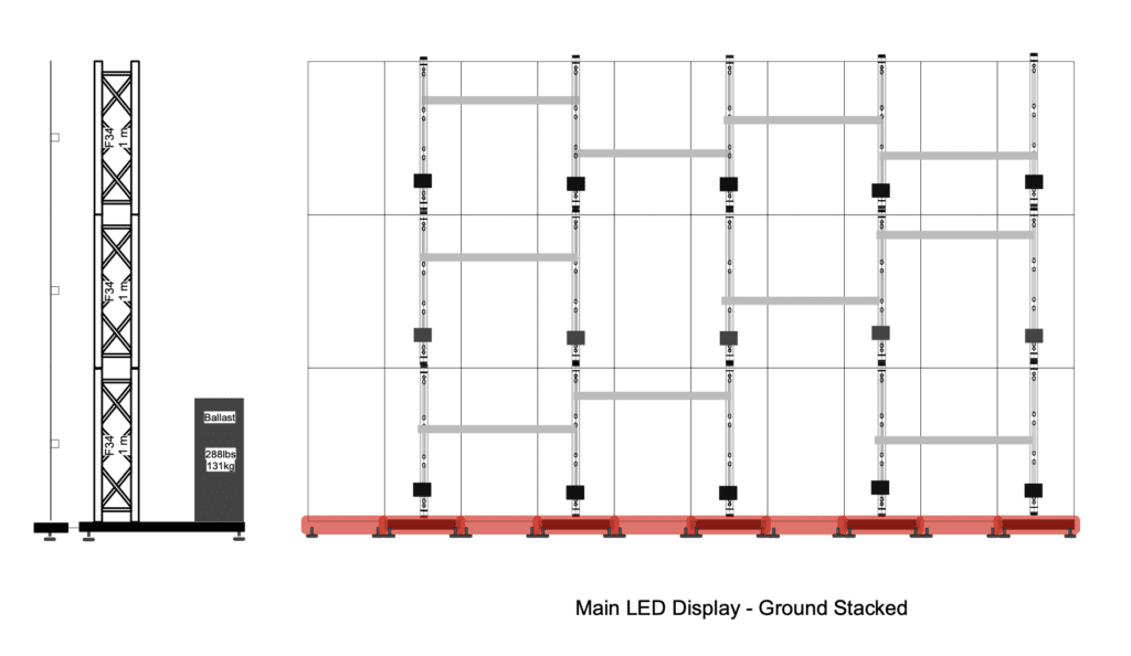
For one, a screen is only as durable as its supporting structure! LED screens that are mounted to or hanging from freestanding truss structures are simple and go up in a snap, but they pay for that with rigidity. It’s easy to recognize the dangers that come with a wobbly truss or scaffold! This can be especially risky with freestanding LED screens as all of the weight of the panels is concentrated on one side of the structure…Which could throw it off balance.

Whether a truss structure is built for it or not, it’s best to add well-secured ballast to a structure whenever wind is in the forecast. As you can see, the screens we use ask for nearly 300 pounds of weight on each of their truss uprights, amounting to a total of almost 1500 pounds!

Diagram illustrating the ground stacking configuration for an LED display truss system. The truss framework is depicted in a simplified diagram, showcasing the arrangement of horizontal and vertical truss sections.
LED Diagram

In addition to weight, there’s more you can do to make sure a screen’s support structure stays upright and strong. Ratchet straps and tiedown straps are your friend! It takes very little time to loop a strap around the structure and tie it off to a nearby building, bollard, or tree, but you gain a great deal of peace of mind. After all, it’s very common for a tent or other light structure to blow over in a storm… but much less common for a whole house to fall over!

In much the same way, it’s good to make sure other types of mounting systems are well-secured. For screens mounted on trailers or vehicles, it sure doesn’t hurt to tie those down to secure structures as well. Of course, you should also have wheel chocks as an extra safety measure. And don’t forget to make sure all screen components are on tight!

And let’s not forget that classic team-up everyone should avoid: electricity and water. An outdoor screen likely has outdoor power, so make sure your power is secured from water ingress from the source all the way to the screen. One of the simplest ways to make a power run safer in strong weather is just to make certain that receptacles are all facing downwards—so water doesn’t fill them up! Of course, you should always disconnect power and keep electrical equipment covered… But just this small change can keep you safe from a flipped circuit breaker or a nasty shock.

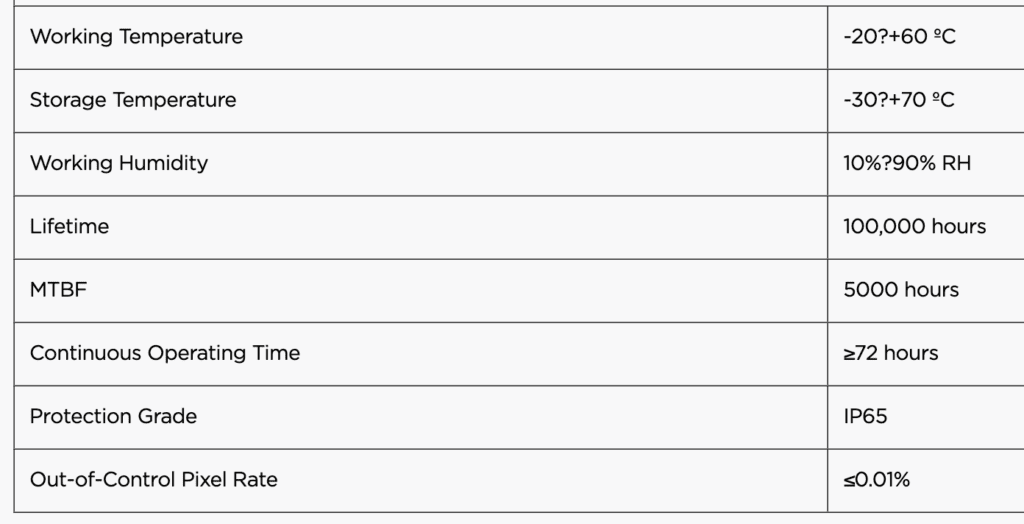
We’ve discussed wind and precipitation, but there’s one more weather-related element to consider: the temperature. Anyone who’s left their phone or laptop in their car overnight in a winter storm knows full well the dangers that come with temperature alone! We can find on the relevant datasheets that individual LED cells are rated for -20 to 60 degrees Celsius (-4 to 140 degrees Fahrenheit). Meanwhile, the LED controller itself is rated for 0 to 45 Celsius (32 to 114 Fahrenheit). That’s not too bad—but remember, there’s all sorts of supporting hardware included to keep an LED screen running!

While a lot of audio and video equipment have similar thermal ratings to those above, not everything can happily run in extreme heat or cold. For example, if you’re sending video to the screen from a MacBook… they’re not rated to go any lower than 50 degrees Fahrenheit. That’s a problem! How do you ensure your LED screen not only survives but thrives at extreme temperatures?

Photograph showing the specifications sheets of an LED screen. The sheets are neatly laid out, displaying technical details, dimensions, and features of the LED display.
LED Data Sheet

Well, at low temperatures, there’s one very good thing to remember: keep everything running! It might be tempting to lock everything down to get through a cold night or a cold snap, but remember that electronics generate heat as long as they’re running. LEDs and other modern electronics are quite energy-efficient, but they still generate heat. It might be just enough to stop dangerous ice from forming on a screen in inclement weather. Just leave it on!

Of course, depending on where you’re set up, there may be restrictions on leaving screens running overnight… not everyone wants to see your videos or logos at midnight, after all. But leaving an LED screen running on a black screen, or something innocuous like a clock, gives you a little extra heat to keep on trucking without being obnoxious. Even “on and idle” is safer for your equipment at low temperatures than “all the way off.”

What about high heat? This is a little trickier, but follow the same rules you do when you’re stuck outside on a hot day: Shade, airflow, and refreshment! Getting out of the sun is crucial for us, just as it is for delicate electronics. Keeping the video controller and assorted hardware out of the sun is crucial—with a tent, an umbrella, or just a shady tree. Similarly, though modern LED screens are bright, do you know what makes them look brighter? The shade! That way, you improve the looks of your screen and cut the risk of overheating.

For the video controller and other supporting equipment, bump up that airflow—even a simple box fan nearby is enough to keep most electronics from overheating even on very hot days. It’s a great addition to your kit! And as for refreshment… well, if your screen panels are waterproof, there’s no harm in spraying them down! But if things get extreme, it might be wise to shut down the screen for a brief period. Luckily, most electronics will shut down when they get too hot rather than becoming damaged, but it’s much better to be safe than sorry. Treat it with care!

Caring for an LED screen in inclement weather is quite similar to the way you treat other electronics. Having a mind for water ingress, high winds, and extreme temperatures will ensure that your hardware stays intact and capable for years to come—and even stay up and running in conditions that look much more intense than you may expect! Of course, safety is always a top priority when you’re putting on events, so it’s crucial to balance your capability with the safety of your team and the event’s attendees. But rest assured—with the right planning and preparation, an LED screen is ready for whatever weather may arise!

Jump Into the World of Royalty-Free Music: Your Ultimate Guide

Screenshot showing the user interface of the Artlist platform. The interface features various sections such as music library, search bar, and navigation menu, providing access to a wide range of royalty-free music and sound effects.

When you hear “video production,” your mind probably goes to shot composition, lighting, timing… how a video looks. But what many people neglect or completely forget is how a video sounds.

Have you ever watched a video and felt like there was something missing in between the lines? Or found yourself nodding off while watching a video with an important message? Chances are, what’s missing is the right music. Just as much as snappy editing and a great message… Background music sets the tone of a video and moves the viewer through it from start to finish. In other words…

Having fun pulling pranks on your friends? A lighthearted song in the background helps you move from laugh to laugh. Need to impress the importance of a serious topic? Lead with something somber, but not too slow. Sharing someone’s incredible story? A cinematic track will push it to the limit!

Of course… It would be easy to track down your favorite song that’s making the radio airwaves or blowing up on Spotify… but it’s not quite that easy. What’s the problem with using popular songs for your videos? First of all, copyrights can and will stop your video before it can get off the ground.

The right to play and use almost all popular music you hear today is owned by one of several major record labels. Using the top-40 music you listen to every day in your videos is almost always a violation of copyright law. At best, this will result in any revenue you made from the video belonging to the record label. But in most cases your video will just be muted or deleted. No matter how hard you worked on a video… It won’t be worth the effort if people can’t actually watch it!

Screenshot displaying a YouTube copyright takedown notification. The notification includes details such as the title of the video, the reason for the takedown, and information on how the uploader can respond or appeal. This notification indicates that the video has been removed from YouTube due to a copyright infringement claim.
YouTube Copyright Takedown

As much as we love hearing strong vocals from our favorite artists, songs with vocals are often not what you’re looking for as accompaniment for a professional video. Apart from the obvious issue of having the singer drown out your speaking roles without careful mixing… The lyrics of a song can often detract from the goal and message of a video. For example, you may find a song that sounds slow and heartfelt for a wedding video… but the lyrics are about a breakup. That won’t go over well!

So, what you need is a song that fits the tone and message of your video, likely without vocals, that isn’t going to get your video taken down for copyright violations. Where do you turn?

Stock music, royalty-free music, production music—call it what you will, there’s a whole industry around providing songs for people to use in their work without having to make it themselves. Stock music companies have been around since sound was first added to movies. So, there’s no lack of content to use for your projects.

What’s the best part about using stock music? Unlike record companies which share the profits from every song with its original creator, stock music companies own their music outright, so they can do with it whatever they like. Generally, this means you can get the rights to use a song more easily and for a lower price…Even for free! The specific terms vary for each service, but in general you can pay a subscription or a one-time free for access to a huge library of music which you have the rights to use in your own work. No more copyright takedowns!

And because these libraries are built specifically for the sake of making videos and other content, they do their best to make life easy for you. Have a look at the user interface for Artlist, the service we use most often at BCC Live:

Screenshot showing the user interface of the Artlist platform. The interface features various sections such as music library, search bar, and navigation menu, providing access to a wide range of royalty-free music and sound effects.
Artlist

Sort by your tone, the type of video you’re making, what instruments you want to hear, or just what other people have been using, right there. Every category has dozens of songs on call for you to listen through and choose what fits the best. Our team puts a lot of value on getting videos finished and sent to our clients quickly, and often you can find the right song on Artlist in seconds!

Other services like Epidemic Sound, Musicbed, or Incompetech have different ways of sorting and presenting their options, but once you learn how their system works, you’ll be browsing music in no time. But when you have access to thousands of songs… how do you pick the right one?

Sure, it’s easy to say, “this is a funny video, so I need a funny song.” But do you? And which song? To pick the right song for your video, first consider both the text and the subtext of your video. If the intent (subtext) is to be funny, but the video itself (the text) is about someone sneakily stealing a lunch from the office refrigerator, wouldn’t an overly serious “secret agent” song be a better fit to get a laugh? If someone in your video is sharing their story of heartbreak, but the overall goal of the video is to lead the viewer on a story of triumph, which tone should you choose?

There’s no one-size-fits-all rule for what tone to select, just as there’s no “perfect song” for every video. Should you lift up what you feel is your video’s weak point, or accentuate its greatest strength? Consider it carefully… Your first impression might not be the right one!

Even once you’ve figured out what mood and theme to look for, there’s another crucial detail to consider: timing. The length and pacing of a video are absolutely crucial—especially in the world of TikToks and Instagram Reels, which impose hard limits on their video lengths and hang their success on “short and snappy.” Your music must fit that as well! When you’re trying to find the right song for your video, it’s best to do so either before you start your intensive editing pass or after you’ve got all the timing of your edits down pat. Why? So you can find something that hits your visual beats at the right time!

This doesn’t mean you need to sync every action and cut to a beat of the song like it’s a music video—far from it. Rather, knowing the visual tempo of your video and the timing of emotional highs and lows lets you look for a song that roughly follows that path. If you’ve been building towards a reveal in your video, how nice would it be to have the music crescendo at the same moment? Or, if you don’t feel like some of the cuts are very interesting, wouldn’t it be nice to have the music shift at the right time to add extra vigor?

Similarly, the tempo of a song should fit both the mood and the pace of your video. Generally, the shorter your clips and the higher the action, the higher a tempo needs to be to fit. It’s simple enough to do this by trial and error, but some services allow you to sort by tempo to make this easier.

Screenshot displaying the user interface of Incompetech Tempo. The interface showcases various controls and options for adjusting the tempo of music tracks.
Incompetech Tempo

What’s the point of using stock or royalty-free music? Overall, it makes the video production pipeline much easier. The simple licensing means you no longer need to worry about videos being restricted or removed due to copyright violations, and most stock music providers make it very easy to browse for the perfect song. As much as it might be fun to use a popular or trending song over a relatively unknown stock track, the painless nature of using stock music makes having access to a stock library a must-have for any video creator. It’s well worth it to pick up a stock library for yourself!

Screenshot of a Final Cut Pro project timeline featuring stock music. The interface displays audio waveforms and editing tracks, indicating the incorporation of royalty-free music into the video editing project. This suggests the integration of music to enhance the audiovisual experience of the final video production. Various editing tools and controls are visible, allowing for precise manipulation and synchronization of the music with the video content.
Final Cut Pro With Stock Music

 There’s plenty more that can be discussed here—matching edits more closely to beats, using stems to control exactly what instruments you hear, mixing to fill out your soundscape more effectively, and more. If you want to know more, reach out! What’s more, the world of music licensing is fascinating and goes much deeper than what is discussed above. Stay tuned for an in-depth look at that!

Graphic Design – Tips & Tricks to Get Started Now!

An image of a vinyl cutter in operation, with a sharp blade precisely cutting through a sheet of vinyl material.

Graphic design is the art and practice of creating visual communication that conveys a message, an idea, or an emotion. It is a versatile and dynamic field that encompasses many disciplines such as typography, illustration, photography, video and broadcast, animation, and web design. Graphic designers use various tools and techniques to create effective and appealing designs for different media and purposes, such as logos, posters, magazines, websites, apps, games, and more.

In this blog, I will discuss some of the first need-to-know lessons that any designer should consider before taking on a new graphic design project. Whether you are a beginner, a professional, or just curious about graphic design, I hope you will find something useful and interesting in this blog.

Welcome to the world of graphic design!

Just as anyone has had that one favorite pair of scissors, their most trusted mechanical pencil for taking a test in school, or a well-loved kitchen knife that gets used 99% of the time for their cooking–designers tend to fall into a comfort zone with one of the many design software solutions available. One quick look at the Adobe Creative Cloud can be immediately overwhelming once you realize it contains more than 20 different mobile and desktop apps for creative design.

An image showcasing the Adobe Creative Cloud platform interface on a computer screen. Various creative software icons, such as Photoshop, Illustrator, and Premiere Pro, are visible, indicating access to a range of digital design and editing tools.
Adobe Creative Cloud

While you certainly don’t need to be a master at them all to be a competitive graphic designer, it absolutely is critical to realize this is like a well-stocked toolbox in a master mechanic’s shop. You have access to do anything effectively, but you’re still allowed to have that one beat up screwdriver handy in your front pocket to get started on any project.

Let’s talk about specifics here. All graphic designers have heard a colleague at one point or another that they are a “Photoshop Person” or an “Illustrator Person.” While it is true they look almost identical and there is a lot of overlap in features and functionality, they are fundamentally different software built on entirely different frameworks. Starting a design in the wrong tool can set you up for failure, and you won’t realize it until you’re in the final steps of your project.

Screenshot displaying the user interface of Adobe Illustrator software. The interface features various design tools, panels, and menus characteristic of the vector graphics editing program.
Adobe Illustrator user interface
Screenshot showcasing the user interface of Adobe Photoshop software. The interface features a multitude of editing tools, panels, and menus, typical of the powerful raster graphics editor.
Adobe Photoship user interface

This is where we get down to brass tacks on what makes Illustrator different than Photoshop. For many, one word is an entirely foreign, seemingly “made-up” word; while the other stirs up nightmares from high school Physics class. What do they mean, and why do we see them peppered about in various menu tabs? Are they nouns? Verbs? Adjectives?

It comes down to this: raster images are just that–images. Most related to actual photographs from a camera, these are digital compressions of light in the real-world by averaging points of color into computer-friendly grid systems. The real keyword here: pixels. Anything that is a pixel-based rendering is a raster image.

An abstract image showing a multitude of small squares of varying colors arranged in a grid pattern. The squares, known as pixels, are the building blocks of digital images.
Pixels
Image displaying the BCC Live Pixelated Logo.
BCC Live Pixelated Logo

Vector images, on the other hand, are graphic elements that designers create with vector line information. The lines aren’t “lines,” in the way you may initially expect, which would have some thickness like some skinny rectangle made by running a marker along some paper. These lines are more “data.” Code for draw the line this way, in this shape.

Image illustrating vector handles, small anchor points and control handles used in vector graphics software. These handles are strategically placed to manipulate and adjust the shape of vector objects.
Vector Handles

This does in fact relate to that fuzzy concept in Physics you learned about once upon a time–

something, something … direction of force … something … velocity …

While you don’t need to retake Physics 101 as a pre-requisite to Graphic Design, it’s worth recognizing the roots of the terms because when rendering images based on vector data, computers are given a set of instructions, or a “recipe” for how to plot images on a page rather than a fully cooked meal, which would be akin to raster images.

Here’s how you can think of rendering a vector image:

  • The computer will begin with an origin or starting point.
    • Travel 3 steps east. Place a new point.
    • Travel 3 steps north. Place a new point.
    • Travel 3 steps west. Place a new point.
    • Travel 3 steps south. Connect with the origin.
  • Voila! We have a square.
Graphic design project featuring a 3 x 3 square grid layout.
3 X 3 square grid

This is FAR more data efficient. And the real money-maker here? It is scalable. Take the above recipe, and multiply “3 steps” x2. Try x5. Or even x100. It really makes no difference, if you want to draw a square to be rendered 50ft wide on a large billboard, the file contains the same amount of data as a 1-inch square to render a perfect, full-quality square with no degradation of quality. For an equivalent quality 50ft square based on pixels, we’re talking billions of pixels that need to be stored and packaged, which would never be a usable amount of data for a computer or printer.

Adobe Photoshop, a flagship product from Adobe, is their solution to Raster-Based Image editing. The program is meant to take a set of pixels, such as from a digital camera, and offer tools to manipulate those pixels. Hence, the name, Photoshop. Adobe Illustrator, on the other hand, is the sister companion app (read: not rival) meant for Vector-Based Illustrations.

This bottom line iswhat may have already lead you to an idea for what type of projects are best-suited with one of these tools over the other. Here are some examples:

  • Drawing a Logo: Illustrator
  • Color-correcting wedding photos: Photoshop
  • Designing a new typography: Illustrator
  • Digitally painting a comic book: Photoshop
  • Creating a printable brochure with lots of text for your business: Illustrator

Can you draw a logo in Photoshop? Absolutely. For many small businesses, you may just need a branded image in email signatures, invoices, and the website. But then imagine one day, the business grows and you want a big beautiful channel letter, internally lit sign on your new office space. Or maybe some neat cut vinyl stickers to sell as merchandise. CNC machines and vinyl plotters used to cut those letters need that vector “recipe” to cut your design–they don’t understand pixels. Unfortunately, the logo must be redrawn.

Image of a Google sign mounted on a sleek, modern building facade. The iconic multi-colored letters stand out against the neutral background, indicating the presence of a Google office or facility.
Google Sign
Starbucks sign displayed prominently on the exterior of a building. The familiar green and white logo is easily recognizable, signaling the presence of a Starbucks coffee shop within the establishment.
Starbucks Sign

Vector images can always be rasterized. You can’t always go the other way. Rasterizing should be considered destructive. You can never scale up, change the text, or alter shapes and layouts as effectively as you could when it was still a vector.

Aside from raster/vector based considerations, you should also consider the medium of the possible uses. Will it be printed? Will it go on a website or video broadcast? Most printers use CMYK based color profiles. This means they use ink cartridges of cyan, magenta, yellow, and black to mix and create a large array of perceivable colors. This potential array, or gamut, is limited–it’s very good at recreating deep natural reds, purples, and greens, but not very good at vivid reds and bright blues.

An image showing four CMYK ink cartridges arranged side by side. The cartridges are labeled with their respective colors: cyan, magenta, yellow, and black. Each cartridge is designed to fit into a printer, representing the essential colors used in the printing process.
CMYK ink cartridges

All screens, on the other hand (laptops, mobile devices, TVs, LED screens) use RGB profiles to drive red, green, and blue lights to mix another limited, but different gamut of possible colors. This is where you get your bright, glowing reds, blues, and greens; but less of the rich, deep natural colors. These are limitations on the media themselves and really cannot be overcome. For a predictable outcome on distributed designs, it’s critical to know what color space you are limited to.

Sure, if you design in an RGB color space and send the job to a printer, it’s going to print. Printer profiles are designed to recognize what color space they are given, and apply some type of translation or correction to faithfully reproduce what is given to it. However, why not do the translation, or original color design yourself? If you make creative designs along the way based on a rendering on your laptop in the correct color space, you may avoid the common reprint headaches like, why does my red logo look brown? Or, why does my blue look black?

Now let’s assume you’re tasked with drawing a new logo. We’ve already learned that Illustrator is the best tool for the job. Immediately upon opening the software, you’re greeted with a typical “New Document” dialog. I actually like using blank document presets as a fast way to set basic settings that we’ve discussed thus far such as color space.

Screenshot capturing the Adobe Illustrator new document screen. The interface presents options for setting document properties such as dimensions, orientation, and units.
Adobe Illustrator New Document screen

My go-to for any physical design (ie. Logos, posters, stickers, etc.) is “Letter” under the Print tab, and make sure my units are set to inches. For digital design, I’ll reach for the “Web-Large” preset under the Web tab. The quick settings chosen by these templates are actually really helpful to use and understand:

This is flexible because for one, Illustrator allows you to draw outside of the canvas bounds (something Photoshop didn’t let you do until relatively recently). Second, it’s easy to change at any time (use shortcut Shift + O to open your artboard settings). Letter page at 8.5” x 11” simply makes it convenient to spit out a proof that is both printable and PDF friendly.

If you’re designing a logo to be cut in vinyl or embroidered, you should thoughtfully consider the real size of some text. Anything less than about ¼” tall, or elements with less than 1/8” stroke will be tough to produce. Often you may be designing to full-size applications such as vehicle vinyl graphics, where you need to make sure your design fits exactly as expected. Pixel units are helpful for the digital space to understand that a line less than 1 pixel wide. For example, will never be reliably produced in a rasterized output like a computer or TV screen.

An image of a vinyl cutter in operation, with a sharp blade precisely cutting through a sheet of vinyl material.
Cutting plotter

This is a tool specifically crucial for something that is getting printed. This essentially creates a set of guidelines outside your artboard dimensions to contain elements that are designed to fall off the edge of the page. When print jobs are cut, this cut path is never perfect. If you provide 1/8” of extra color that “bleeds” off the artboard, you can ensure you won’t be left with that silly crooked looking white line on the edge.

CMYK vs RGB. As we discussed, digital design should be done in RGB, physical print design should be in CMYK.

These are your drop shadows, blending tools, gradients, etc. Most printers can often produce a high 300ppi resolution or more. Beefing up the “pixel” count in these effects can produce better results. It’s worth knowing that it’s also 4x the data of 72ppi, so consider this wisely when creating a banner that’s 24ft wide with drop shadows. 72ppi is the limitation of any digital screen, so there’s never much need to go higher than this for digital design.

While I usually set this as default right off the bat, knowing this tool exists even in the menu bar under View (or use Option + Command + Y to open Pixel Preview) can be helpful to preview what the rasterization of a screen will look like.

Congratulations! You finished your graphic design. You may be tempted to share the .AI file, but beware because some people use other software that may or may not be capable of handling Illustrator’s native file format.

In most cases, you may find yourself needing to export multiple files. First would usually be some kind of proof, or document that is easily emailed, viewed on a phone, printed in the customer’s office printer. Sometimes it’s simple enough to snap a screenshot. This can be great because it will rasterize your designs, protecting the valuable editable elements that could be taken to your competitor. The downfall, though, is you may be robbing some fine viewable detail for the customer to zoom in on. It’s also very hard to keep consistent, because the size, shape, and placement of the screenshot will always be different.

Second, would be production files. These are what would actually be sent to a printer or manufacturer to have produced or used on-air as live broadcast graphics. The focus here is compatibility, appropriate file size, and of course full-quality. Notice I say “full” quality, and not super duper high quality. Higher is not always better, because it takes away from another focal point: appropriate file size. We just want it to be the fullest quality it can be, but nothing more.

So what’s the best output for these files? Honestly, it’s the same export: PDF. PDF (Portable Document Format) is specifically designed to be a high-compatibility sharing format. Meaning anyone can preview it whether on Mac, PC, or mobile phone. Any software or hardware should be able to open it as well, whether it be office printer, large format printer, Illustrator, CorelDRAW, CNC machine, and so on.

There are a TON of different settings you can tweak in how a PDF file is created. You may be forgiven for glossing over the 7 pages of checkboxes and dropdowns of meaningless jargon and just hitting “Save PDF.” The biggest takeaway? PDF/X-4:2008. This is the preset made available by Illustrator that for 99% of cases makes all those decisions for what you need. It optimizes file sizes by compressing raster elements down to “just high enough.” It compresses text and line art, and preserves a good level of editability for most vector drawing software.

Image depicting a logo or label with the text 'PDF/X-4' displayed prominently. PDF/X-4 is a file format standard used in the creation and exchange of print-ready documents.
PDF/X-4

A note on fonts… The compressed text and line art option in the PDF/X-4 preset ensures that previewing the file on most devices will render any font you may have used – whether that machine has the font installed or not. However, if you want to make sure the font doesn’t get flipped to Helvetica or Calibri in the final print, it is a good idea to outline your text in your production files. Do this by selecting all text, going to the Menu Bar, Type, Create Outlines (or use shortcut Command + Shift + O to create outlines).

Image showcasing a graphic design project where text is outlined. The outlined text features clear, distinct edges, enhancing readability and visual impact.
Text Outlined

This is destructive – meaning the text can never be editable via keyboard again, but will turn them into basic vector shapes that will not lose their styling or layout.

Graphic design can seem complex, but it doesn’t have to be. By understanding the fundamentals and using the right tools for the job, you can create professional-looking designs that communicate your message effectively. Remember that practice makes perfect, so don’t be afraid to experiment and have fun! With a little effort, you can unlock your creative potential and become a confident graphic designer.

Want to take a deeper dive into graphics? Check out our other blog posts!

Innovating Custom Graphics Systems for IRONMAN VR Series Live on Facebook Watch

Revolutionary HTML5 Graphics for a Better Broadcast