The first things you need to know before beginning a graphic design project
Graphic design is the art and practice of creating visual communication that conveys a message, an idea, or an emotion. It is a versatile and dynamic field that encompasses many disciplines such as typography, illustration, photography, video and broadcast, animation, and web design. Graphic designers use various tools and techniques to create effective and appealing designs for different media and purposes, such as logos, posters, magazines, websites, apps, games, and more.
In this blog, I will discuss some of the first need-to-know lessons that any designer should consider before taking on a new graphic design project. Whether you are a beginner, a professional, or just curious about graphic design, I hope you will find something useful and interesting in this blog.
Welcome to the world of graphic design!
Consider using the right tool for the graphic design project
Just as anyone has had that one favorite pair of scissors, their most trusted mechanical pencil for taking a test in school, or a well-loved kitchen knife that gets used 99% of the time for their cooking–designers tend to fall into a comfort zone with one of the many design software solutions available. One quick look at the Adobe Creative Cloud can be immediately overwhelming once you realize it contains more than 20 different mobile and desktop apps for creative design.
While you certainly don’t need to be a master at them all to be a competitive graphic designer, it absolutely is critical to realize this is like a well-stocked toolbox in a master mechanic’s shop. You have access to do anything effectively, but you’re still allowed to have that one beat up screwdriver handy in your front pocket to get started on any project.
Let’s talk about specifics here. All graphic designers have heard a colleague at one point or another that they are a “Photoshop Person” or an “Illustrator Person.” While it is true they look almost identical and there is a lot of overlap in features and functionality, they are fundamentally different software built on entirely different frameworks. Starting a design in the wrong tool can set you up for failure, and you won’t realize it until you’re in the final steps of your project.
Raster vs. Vector
This is where we get down to brass tacks on what makes Illustrator different than Photoshop. For many, one word is an entirely foreign, seemingly “made-up” word; while the other stirs up nightmares from high school Physics class. What do they mean, and why do we see them peppered about in various menu tabs? Are they nouns? Verbs? Adjectives?
It comes down to this: raster images are just that–images. Most related to actual photographs from a camera, these are digital compressions of light in the real-world by averaging points of color into computer-friendly grid systems. The real keyword here: pixels. Anything that is a pixel-based rendering is a raster image.
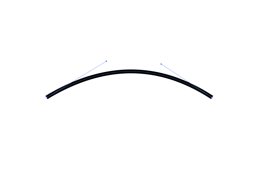
Vector images, on the other hand, are graphic elements that designers create with vector line information. The lines aren’t “lines,” in the way you may initially expect, which would have some thickness like some skinny rectangle made by running a marker along some paper. These lines are more “data.” Code for draw the line this way, in this shape.
This does in fact relate to that fuzzy concept in Physics you learned about once upon a time–
something, something … direction of force … something … velocity …
While you don’t need to retake Physics 101 as a pre-requisite to Graphic Design, it’s worth recognizing the roots of the terms because when rendering images based on vector data, computers are given a set of instructions, or a “recipe” for how to plot images on a page rather than a fully cooked meal, which would be akin to raster images.
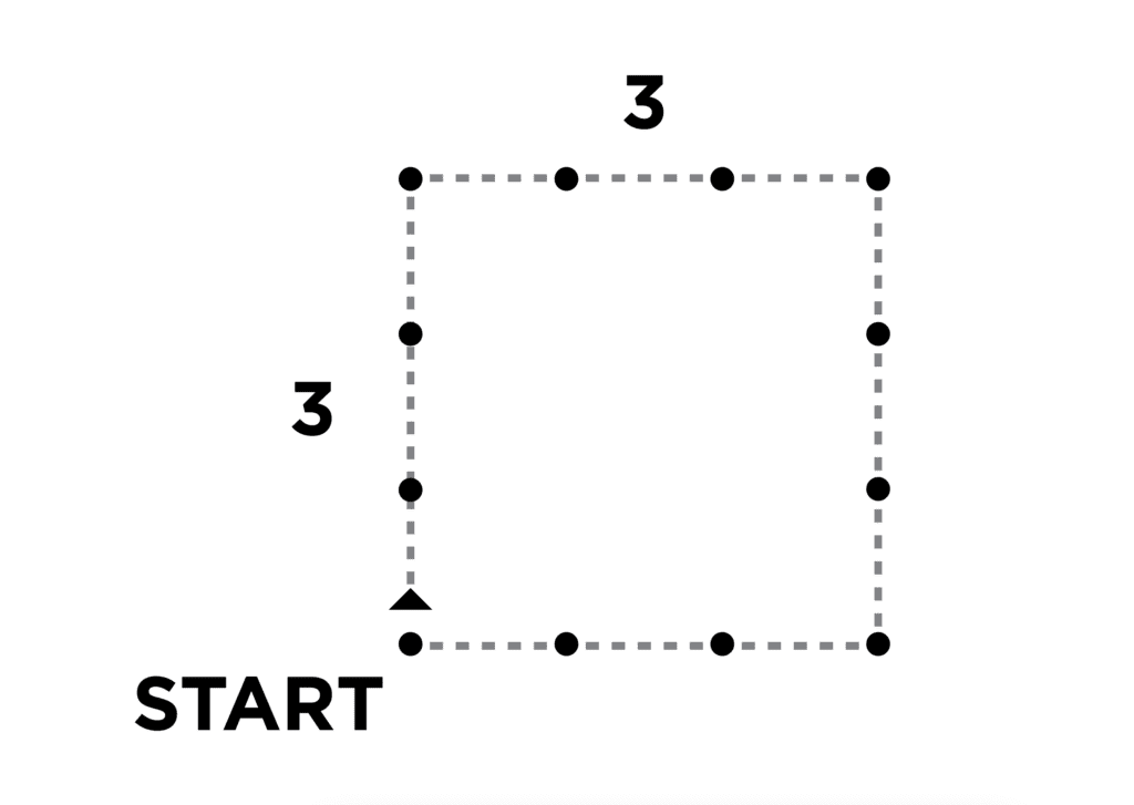
Here’s how you can think of rendering a vector image:
- The computer will begin with an origin or starting point.
- Travel 3 steps east. Place a new point.
- Travel 3 steps north. Place a new point.
- Travel 3 steps west. Place a new point.
- Travel 3 steps south. Connect with the origin.
- Voila! We have a square.
This is FAR more data efficient. And the real money-maker here? It is scalable. Take the above recipe, and multiply “3 steps” x2. Try x5. Or even x100. It really makes no difference, if you want to draw a square to be rendered 50ft wide on a large billboard, the file contains the same amount of data as a 1-inch square to render a perfect, full-quality square with no degradation of quality. For an equivalent quality 50ft square based on pixels, we’re talking billions of pixels that need to be stored and packaged, which would never be a usable amount of data for a computer or printer.
Adobe Photoshop, a flagship product from Adobe, is their solution to Raster-Based Image editing. The program is meant to take a set of pixels, such as from a digital camera, and offer tools to manipulate those pixels. Hence, the name, Photoshop. Adobe Illustrator, on the other hand, is the sister companion app (read: not rival) meant for Vector-Based Illustrations.
Consider all possible use-cases of the design
This bottom line iswhat may have already lead you to an idea for what type of projects are best-suited with one of these tools over the other. Here are some examples:
- Drawing a Logo: Illustrator
- Color-correcting wedding photos: Photoshop
- Designing a new typography: Illustrator
- Digitally painting a comic book: Photoshop
- Creating a printable brochure with lots of text for your business: Illustrator
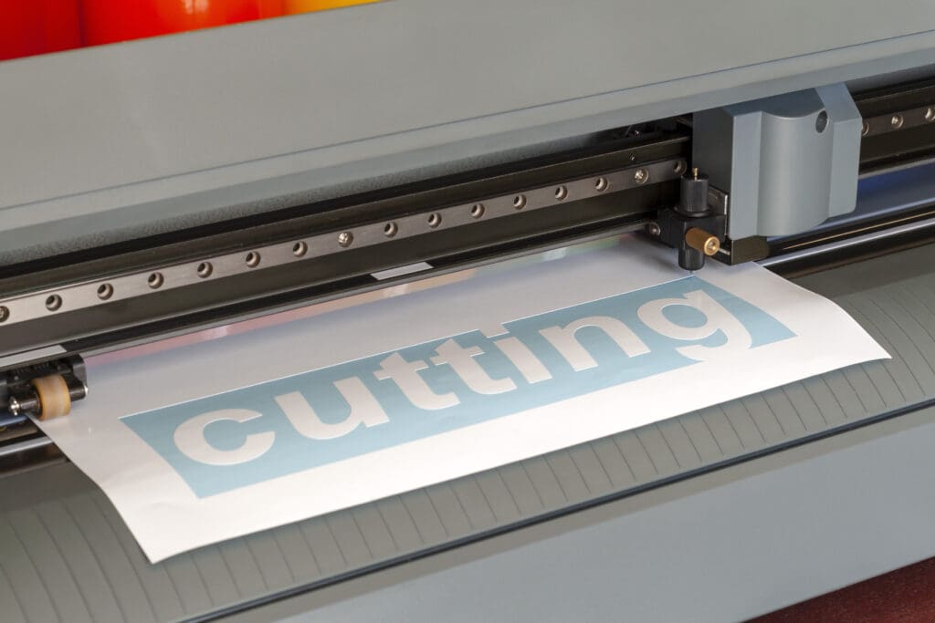
Can you draw a logo in Photoshop? Absolutely. For many small businesses, you may just need a branded image in email signatures, invoices, and the website. But then imagine one day, the business grows and you want a big beautiful channel letter, internally lit sign on your new office space. Or maybe some neat cut vinyl stickers to sell as merchandise. CNC machines and vinyl plotters used to cut those letters need that vector “recipe” to cut your design–they don’t understand pixels. Unfortunately, the logo must be redrawn.


Vector images can always be rasterized. You can’t always go the other way. Rasterizing should be considered destructive. You can never scale up, change the text, or alter shapes and layouts as effectively as you could when it was still a vector.
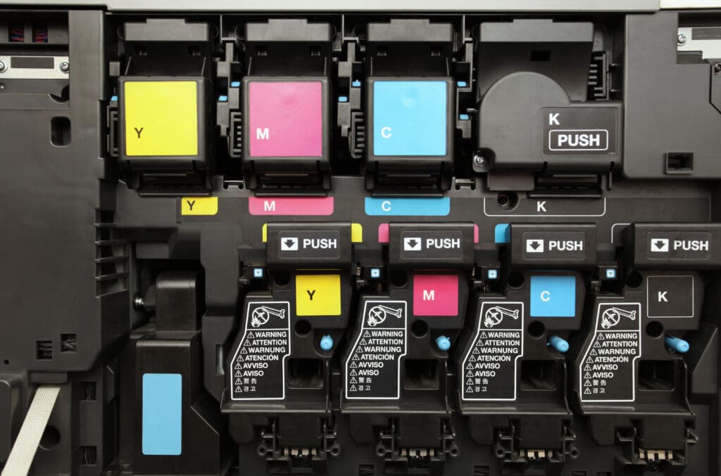
Aside from raster/vector based considerations, you should also consider the medium of the possible uses. Will it be printed? Will it go on a website or video broadcast? Most printers use CMYK based color profiles. This means they use ink cartridges of cyan, magenta, yellow, and black to mix and create a large array of perceivable colors. This potential array, or gamut, is limited–it’s very good at recreating deep natural reds, purples, and greens, but not very good at vivid reds and bright blues.
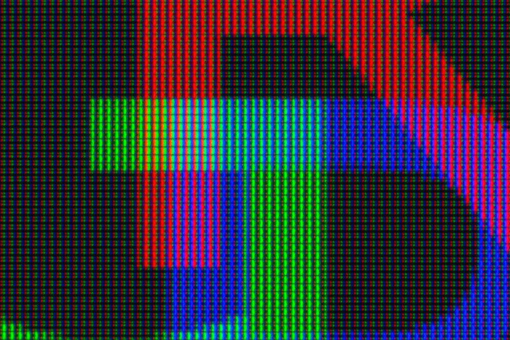
All screens, on the other hand (laptops, mobile devices, TVs, LED screens) use RGB profiles to drive red, green, and blue lights to mix another limited, but different gamut of possible colors. This is where you get your bright, glowing reds, blues, and greens; but less of the rich, deep natural colors. These are limitations on the media themselves and really cannot be overcome. For a predictable outcome on distributed designs, it’s critical to know what color space you are limited to.
Sure, if you design in an RGB color space and send the job to a printer, it’s going to print. Printer profiles are designed to recognize what color space they are given, and apply some type of translation or correction to faithfully reproduce what is given to it. However, why not do the translation, or original color design yourself? If you make creative designs along the way based on a rendering on your laptop in the correct color space, you may avoid the common reprint headaches like, why does my red logo look brown? Or, why does my blue look black?
Setting up a new graphic design project in Adobe Illustrator
Now let’s assume you’re tasked with drawing a new logo. We’ve already learned that Illustrator is the best tool for the job. Immediately upon opening the software, you’re greeted with a typical “New Document” dialog. I actually like using blank document presets as a fast way to set basic settings that we’ve discussed thus far such as color space.
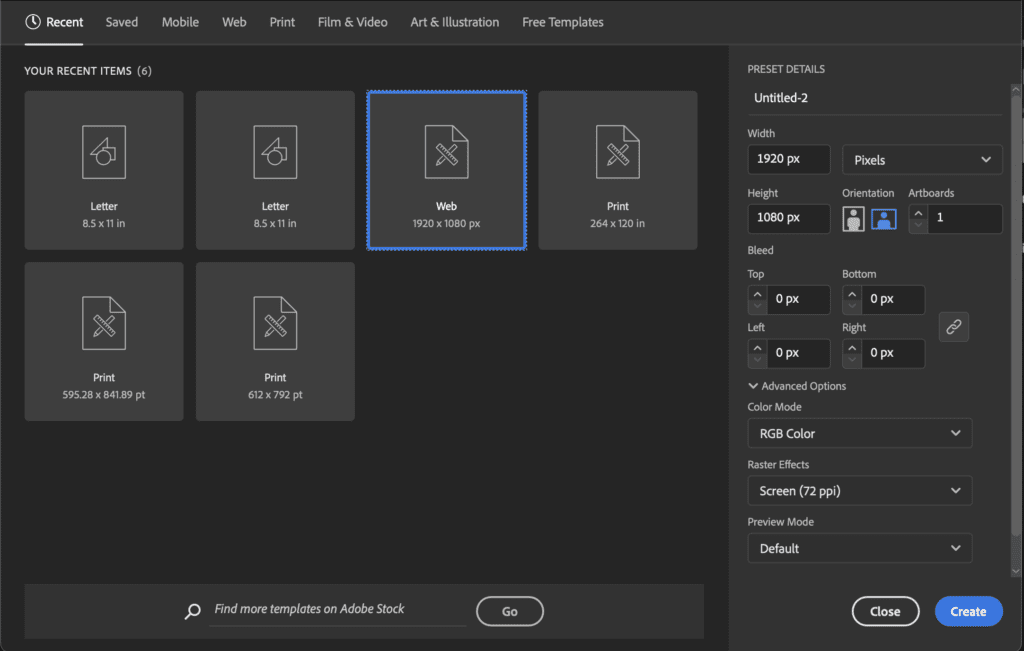
My go-to for any physical design (ie. Logos, posters, stickers, etc.) is “Letter” under the Print tab, and make sure my units are set to inches. For digital design, I’ll reach for the “Web-Large” preset under the Web tab. The quick settings chosen by these templates are actually really helpful to use and understand:
Dimensions:
This is flexible because for one, Illustrator allows you to draw outside of the canvas bounds (something Photoshop didn’t let you do until relatively recently). Second, it’s easy to change at any time (use shortcut Shift + O to open your artboard settings). Letter page at 8.5” x 11” simply makes it convenient to spit out a proof that is both printable and PDF friendly.
Units:
If you’re designing a logo to be cut in vinyl or embroidered, you should thoughtfully consider the real size of some text. Anything less than about ¼” tall, or elements with less than 1/8” stroke will be tough to produce. Often you may be designing to full-size applications such as vehicle vinyl graphics, where you need to make sure your design fits exactly as expected. Pixel units are helpful for the digital space to understand that a line less than 1 pixel wide. For example, will never be reliably produced in a rasterized output like a computer or TV screen.
Bleed:
This is a tool specifically crucial for something that is getting printed. This essentially creates a set of guidelines outside your artboard dimensions to contain elements that are designed to fall off the edge of the page. When print jobs are cut, this cut path is never perfect. If you provide 1/8” of extra color that “bleeds” off the artboard, you can ensure you won’t be left with that silly crooked looking white line on the edge.
Color Mode:
CMYK vs RGB. As we discussed, digital design should be done in RGB, physical print design should be in CMYK.
Raster Effects:
These are your drop shadows, blending tools, gradients, etc. Most printers can often produce a high 300ppi resolution or more. Beefing up the “pixel” count in these effects can produce better results. It’s worth knowing that it’s also 4x the data of 72ppi, so consider this wisely when creating a banner that’s 24ft wide with drop shadows. 72ppi is the limitation of any digital screen, so there’s never much need to go higher than this for digital design.
Preview Mode:
While I usually set this as default right off the bat, knowing this tool exists even in the menu bar under View (or use Option + Command + Y to open Pixel Preview) can be helpful to preview what the rasterization of a screen will look like.
Best Practices for sharing and exporting graphic design files
Congratulations! You finished your graphic design. You may be tempted to share the .AI file, but beware because some people use other software that may or may not be capable of handling Illustrator’s native file format.
In most cases, you may find yourself needing to export multiple files. First would usually be some kind of proof, or document that is easily emailed, viewed on a phone, printed in the customer’s office printer. Sometimes it’s simple enough to snap a screenshot. This can be great because it will rasterize your designs, protecting the valuable editable elements that could be taken to your competitor. The downfall, though, is you may be robbing some fine viewable detail for the customer to zoom in on. It’s also very hard to keep consistent, because the size, shape, and placement of the screenshot will always be different.
Second, would be production files. These are what would actually be sent to a printer or manufacturer to have produced or used on-air as live broadcast graphics. The focus here is compatibility, appropriate file size, and of course full-quality. Notice I say “full” quality, and not super duper high quality. Higher is not always better, because it takes away from another focal point: appropriate file size. We just want it to be the fullest quality it can be, but nothing more.
So what’s the best output for these files? Honestly, it’s the same export: PDF. PDF (Portable Document Format) is specifically designed to be a high-compatibility sharing format. Meaning anyone can preview it whether on Mac, PC, or mobile phone. Any software or hardware should be able to open it as well, whether it be office printer, large format printer, Illustrator, CorelDRAW, CNC machine, and so on.
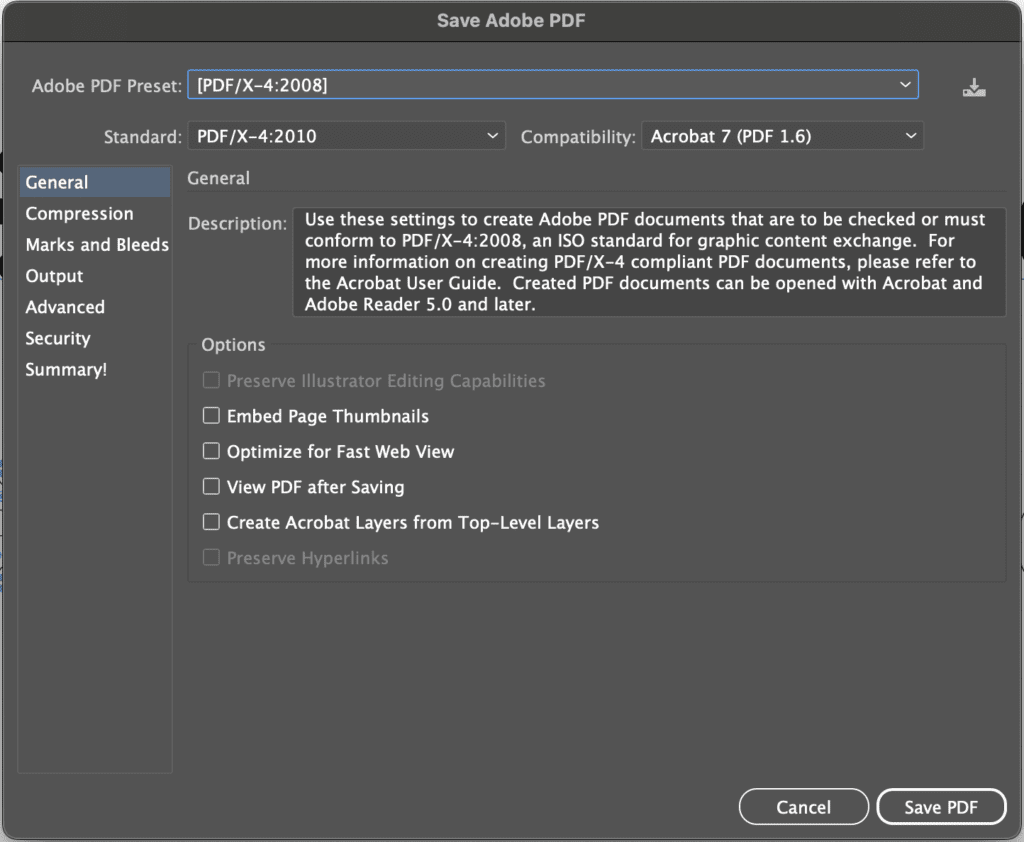
There are a TON of different settings you can tweak in how a PDF file is created. You may be forgiven for glossing over the 7 pages of checkboxes and dropdowns of meaningless jargon and just hitting “Save PDF.” The biggest takeaway? PDF/X-4:2008. This is the preset made available by Illustrator that for 99% of cases makes all those decisions for what you need. It optimizes file sizes by compressing raster elements down to “just high enough.” It compresses text and line art, and preserves a good level of editability for most vector drawing software.
A note on fonts… The compressed text and line art option in the PDF/X-4 preset ensures that previewing the file on most devices will render any font you may have used – whether that machine has the font installed or not. However, if you want to make sure the font doesn’t get flipped to Helvetica or Calibri in the final print, it is a good idea to outline your text in your production files. Do this by selecting all text, going to the Menu Bar, Type, Create Outlines (or use shortcut Command + Shift + O to create outlines).
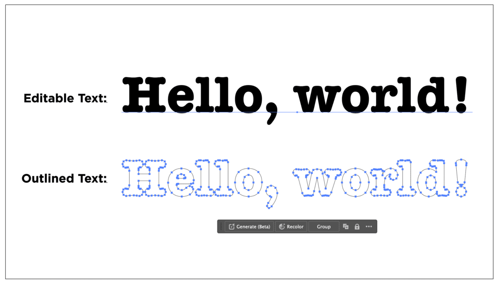
This is destructive – meaning the text can never be editable via keyboard again, but will turn them into basic vector shapes that will not lose their styling or layout.
Final thoughts
Graphic design can seem complex, but it doesn’t have to be. By understanding the fundamentals and using the right tools for the job, you can create professional-looking designs that communicate your message effectively. Remember that practice makes perfect, so don’t be afraid to experiment and have fun! With a little effort, you can unlock your creative potential and become a confident graphic designer.
Want to take a deeper dive into graphics? Check out our other blog posts!
Innovating Custom Graphics Systems for IRONMAN VR Series Live on Facebook Watch