Going into virtual racing, we had to find ways to keep people interested and wanting to tune in to see the action. Each week we’ve tried to up the game with something new. Graphics has been a huge process in upgrading the entire broadcast each week. Some things are big and obvious; others are small but have a nice impact.
Initial Release
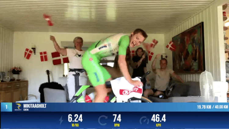
When we started with the virtual races, we had a basic graphics package designed and ready to go with elements you see in most live broadcasts like lower thirds and clocks. Realizing the live telemetry of the bike riders would up the game even more, we started working with Rouvy (virtual bike course) and our graphics partner Flowics on creating an API that would allow us to see the real-time output from the athletes’ bike trainers as they race.
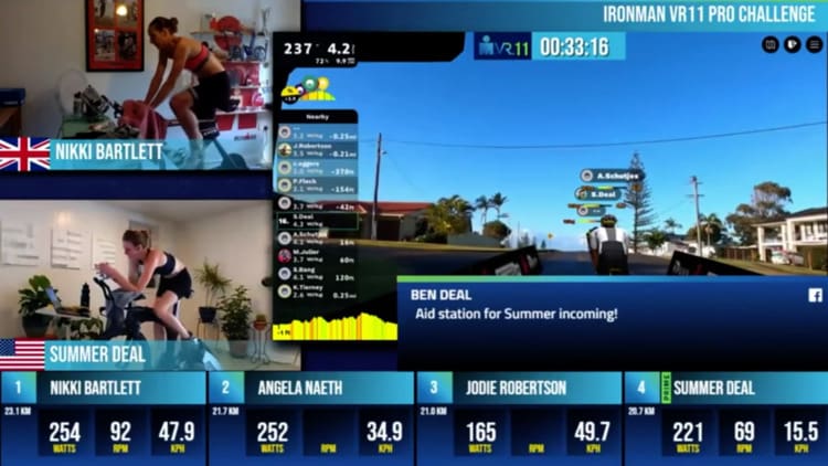
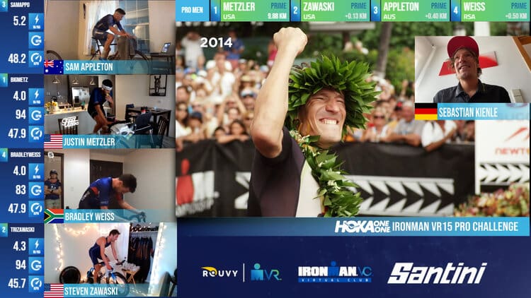
In the bike portion of each race, there are so many different elements we attempt to capture. An expanse of one of the upgrades was in the primes. There are primes on each bike course (sections to win prize money for either the fastest in the section or first to a location, etc.). We started the graphics API integration with an automated small icon reading “PRIME” next to the athlete’s name to indicate they entered the prime and removed it when they exited the prime. This made it easy for the livestream audience and the broadcast hosts to know when the athletes were racing for a prime bonus. Then we upgraded the graphic to include the entire box with the athlete name to change color to indicate they were in the prime. You can see this in the Sebastian Kienle photo on the top of the screen.
Adapting to additional disciplines
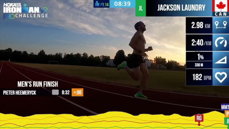
Once we introduced the run concept, it gave us yet another avenue to up the ante on graphics. We are using the actual data generated by the athletes’ GPS files from their smart watches to show their distance, elevation gain, speed, and in some cases, heart rate to create a virtual race. The athletes also filmed their own races with a friend or family member. The onscreen graphics tell the story of where the athletes are running and what their output is. In the photo showing Jackson Laundry, you’ll see Peter has already finished on the left of the screen. On the bottom, you see the individual elevation profiles of all the athletes and their chosen course as well as their position in the run. On the right side, we’ve included their specific telemetry (speed, elevation, distance, heart rate), nationality, name, and color of their icon for the bottom elevation profile.
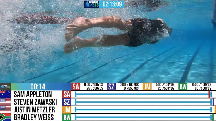
For the swim last week, we did it a little differently based on everyone starting at the same time in the same location. Our team was onsite to capture the video and we used the graphics to show their distance in the pool, what position they were in the race, and when they hit each turnaround. We are looking forward to the next time we incorporate the swim because we are putting it into the hands of the athletes!
“More Graphics!”
Are there places on the screen we could still add graphics? We ask ourselves that all the time. In following the mantra of Will Farrell in Anchorman 2 – “More Graphics!”
Media:
Link to video: https://vimeo.com/108872365
Follow us here and on social to see how it goes – we are planning to feature the next swim again in two weeks 😎
Keep up with us as we continue to evolve and grow. It’s been fun to see the evolution over the last 15 weeks and we are still at it.