Graphic Design – its basic principles are everywhere. You may remember learning in elementary school art class about the elements of design. But what are they, and how can they help me when making a video? Should I even bother to care? I’m not a master painter or potter after all.
The answer is absolutely! Any time you create something visual at all whether it be a promotional poster, logo, photograph, or even a home-built shed in your back yard, you are making decisions on where things go – consciously or not.
For something physical like a shed or suspension bridge, there are codes and laws of physics to dictate where many things go, of course. But for us digital media creators, while we have codes and boundaries to follow like certain specifications for print versus web for example, we have other “best practices” that may help create a more engaging and effective product.
How would I poorly describe my job? I push things around until they look good.
Elements and Principles of Visual Design
For the most part and through the purpose of this blog, I won’t go into great detail about teaching the theories and explaining this entire list as there truly are a lot of great resources online already. There are tons of various versions and exhaustive explanations. Especially while many of the elements are self-explanatory for what they are, we can get started with great designs being familiar them. The basic idea is that you have various ways to create an asset (elements) and various ways to implement those assets (principles).
ELEMENTS


PRINCIPLES
Emphasis




Now check out this wonderful video that demonstrates and explains these elements in action far better than I ever could:
EP, Writing: Karl Sluis
Sound, Music: Michael Coffman
MAKING A LASTING IMPRESSION IN AN INSTANT
We are often battling minuscule presentation times as your content needs to grab the attention of someone scrolling through their visually noisy social feeds, so programming a path in which the viewer should consume the various pieces of information is a very high priority when placing elements on a canvas. But how can we control what people look at?
With a personal background in designing outdoor signage, I know that designers have been battling this same issue for ages. It’s not new in our age of social media and internet content. Similar to scrolling through Facebook and consuming impressions from hundreds of competing brands, we can drive down the highway and consume hundreds of impressions from billboards, monument signs, branded architecture (image right: UTBAPH), store fronts, and other various branded designs. While operating a motor vehicle at 65mph, these impressions may only last for a moment or two as well.
Clearly, we don’t have full control with that whole thing about free will and all. But we do have a number of tools that can strongly encourage people what to look at.
The first thing to consider? The visual design principle of emphasis.
Think back to the motorist driving down the highway who may be a target from a design on a billboard. At the moment they approach your sign from a readable distance, your timer begins to count down for the tiny window you have to grab their attention, make them stop to want to read and finish the content, convince them they need to act on a call to action, and give them the tools they need to remember who you are and a way to contact you in order to convert into a customer later.
That’s a lot of goals to achieve in one short moment before they continue along the road or indeed scroll past your design on social media. It may be no surprise at all that a little thought of psychology can go a long way. Let’s talk about each of these goals:


1) GRAB THEIR ATTENTION
What grabs our attention from our ‘peripheral’ while we otherwise not looking for something to necessarily consume? Think movement. Things that are recognizable. We as humans love to see other human faces, especially happy ones. This is why stock photos of people smiling are so popular. If you can find a happy face of someone enjoying your product or related service, it can go a long way to simply get a person to look at your design. We notice pictures, graphics, and photos first so without a photo, your well-designed and well-recognized logo may serve this function.
What did you look at first? The stock photo with animation to the left, or this paragraph of text?
2) ENCOURAGE TO STOP & READ
Okay, you got their attention. That’s a very hard first step! Once they look away, it’s over. No one scrolls back up their news feed to see what they missed. So how do we get them to stop and read? What’s the “Why?”
Number one, it’s gotta be easy. Keep it simple, stupid. The moment your audience becomes lost or confused about where to start, or how to move forward in your design, even subconsciously, you’ve lost them. Again, we’re talking less than two seconds on a mobile device for people to make this decision of whether to move along or not.
Here’s a secret: at least in the western world, we’ve been conditioned from childhood that content is delivered from top to bottom, left to right. When you pick up a book and open it, you naturally and subconsciously will look for the first words at the top left. I don’t have to tell you how strange and frustrating it would be to pick up a book and have to spend the time and energy to figure out that you need to read the bottom of the righthand page first, with subsequent lines continuing up the page. So why would you sadistically inflict this pain on people while “reading” your visual designs?
Put your logo or attention grabber near the top. Centered, or to the left. Put your primary headline or call-to-action just below it, or to the right of it. Continue adding items as necessary that have a lower role of hierarchy using less emphasis in that general reading order.

3) Remember the Brand
Most of the time, we are hired to do designs for companies that have put many hours and dollars into developing a brand identity. If you have been hired to create media for a large corporation, I can almost guarantee they have a brand identity with a thorough set of guidelines on exactly how to use their colors, logos, typesets, icons, and even styles of language used in text or recorded voice. 90% percent of the time it’s even publicly available on their website to download, and if not, they will happily pass it along to you. Again, because they’ve spent more money than you can imagine in conceptualizing, designing, market testing, and thorough production of files and assets, they want their logo to be used properly.
Read it, and use it!
When you’re trying to work economically and fast, you can save a lot of time by downloading a graphic package that includes original vector art, color swatches, font files, and layout guidelines. Always endeavor to use vector art when possible, rather than saving that low-res image from a Google Search thumbnail.
It’s well worth the time to familiarize yourself with the brand identity. Memorable identity is all about consistency. You’ll know that you are being consistent with their other efforts, and perhaps most importantly, you’re more likely to create something they like on the first pass. Clearly the powers that be have approved the creative direction of the identity guideline, so it reduces your chances of headache of spending hours crafting your perfect masterpiece, only to find out the boss doesn’t like the color you picked, and you have to start over.
LESS IS MORE
I’ve said it before, and I’ll say it again. Keep it simple, stupid.
Less is more. Always. If it doesn’t actively and uniquely accomplish any of these goals, consider removing it. Think of finding ways to make it more concise. No one will ever remember your phone number, so you don’t need to show it. Same goes for your URL that might be ever so slightly different than your actual company name, which could be confusing to remember (if you MUST include it, don’t worry about cluttering your space with ‘https://www.’ People know how the internet works!)
So how will they ever find you? Think how you would find a company that caught your attention on the highway; you’ll probably use Google to search them by name, or even keywords to figure out the name, and confirm you found the right company based on their branding. It’s all about the brand.
Applying Visual Design Principles to Video
I’ve talked a lot about some more traditional graphic design, in the realm of advertisements, signage, and other 2D static media. As promised, we can discuss similar applications to the world of motion video and broadcast.
COMPOSITION
First of all, before we discuss added graphic overlays, let’s take a step back to the day we shoot the video. Remember, filming is yet another form of visual design, where you have to make decisions on where things go.
- How does your background look?
- Does it support your message and foreground material?
- Does it have interesting lines that give depth and add interest?
- Is your horizon straight?
- If you have a person standing and speaking in the foreground, are they framed well?
- Follow the Rule of Thirds
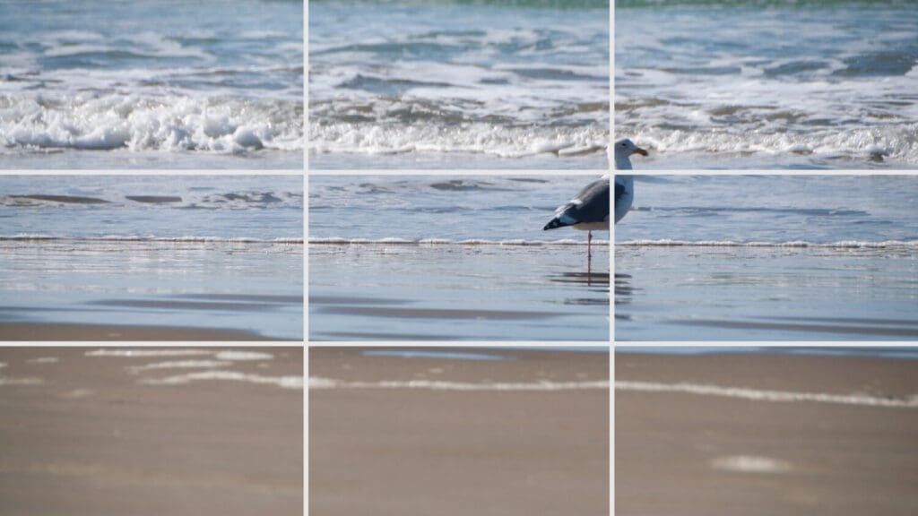
This is probably a great time to consider this massively important design concept based on the principle of balance. You know that annoying tic-tac-toe grid pattern that shows up in your way on your camera? It’s actually your best friend in making sure you get the best shot. It’s there to visually show you where to cut the frame in thirds both vertically and horizontally.
Every single time you frame up a shot for a photo or video, imagine this grid and visually place elements based on it. Without exception (almost). There’s always a way to tweak it so that something could be more balanced to one of these lines.
For example, consider this image below. Relatively subtle vertical divisions of the background are created with the dry sand at the bottom, the glossy wet sand in the middle, and the cresting wave near the top. Furthermore, the bird is more or less placed right at a crosshair of a vertical and horizontal third. This composition is interesting, but still balanced (If I were the photographer, the only thing I may have considered doing differently is pan the camera to the right to place the bird on the left third instead. As a viewer, we see the bird looking to the right so we tend to want to follow its view direction, which is off screen. I like to try to allow the focal point engage the frame, rather than ignore it).
OVERLAY Graphics
Adding graphics to video is perhaps the primary, or at least most cost-effective way to upgrade a video or livestream. It’s what sets apart a professional piece of digital media from your Aunt Susie’s shaky home video.
Many services offer simple graphics to get you started. There are decent basic title presets pre-installed in Final Cut Pro, or default templates in popular online streaming solutions. These are a wonderful place to start, but you’ll immediately find yourself wanting something… better. Less tacky, maybe?
It’s not as hard as you might think to customize your graphics. The templates might make you feel put off, because they’re often these magnificently sparkling with glitter and animated wooshes with sound effects and unicorns. Don’t worry about replicating that!
Once again. KEEP IT SIMPLE, STUPID. LESS IS MORE.
Some of the most effective graphic overlays are simple. Overlays generally consist of designing with typesets, so I’ll give you a list of tips to consider when designing with text. Look back at the examples above and try to recognize how the good example follows many of these guides, while the bad example does not:
- Keep it relatively “flat,” with sparing use of 3D form effects and textures.
- Use minimal colors.
- Use minimal fonts.
- One is usually plenty. Implementing a second can be a valuable tool to help a viewer subconsciously separate different ideas from one another, establishing an emphasis on one element over another.
- Use the right fonts.
- Stick to the brand guide while choosing your fonts.
- If you don’t have a brand guide to follow, put in some due diligence to check websites and other media to be consistent with. If you’re truly starting from scratch, something simple will always do.
Stay away from serif fonts
These are the red-highlighted little tails at the edges of letters. They actually serve a function of increasing reading speed in printed block paragraph text, like a book, which makes fonts like Times New Roman a popular choice in publishing and college essays.

Consider Size
Make sure it’s large enough to read, but not so large that it takes away from the primary focus of your visual hierarchy.
YOUR DROP SHADOW IS TOO MUCH.
Reduce its distance. Reduce its blur. Reduce the opacity. Drop it down and to the right every time. (There are some reading speed and comprehension advantages when putting drop shadows down and to the right, aiding in visual separation and contrast between letters).
Generally, when working in a typical 1920×1080 72ppi workspace on a large font around 120pt size, I may have a starting point of 50% opacity, and equal amounts of offset and blur (ie. 3px offset to the right, 3px offset down, and 3px blur). Then depending on the background I’d adjust from there to have a subtle effect of separation and depth, without actually noticing the shadow is there at all.
Finally, ask yourself, does this make it easier to read? If not, scrap it! It’s too much.
Too Much
Appropriate


Take a step back from your computer. Perhaps relax your eyes a little bit out of focus. Which example is easier to read? Although the text itself is identical in size, color, font, tracking, and so on; the example on the right still appears brighter, larger, and clearer.
Try using a light color text on a dark background
There are some interesting studies that include effectiveness strategies including the readability of text with various combinations of colors. Although there are exceptions to the “light on dark” rule, it’s a great place to start. Certain bad combinations create a visual “vibration” which you want to avoid. Complimentary colors tend to have this effect on text that makes them hard to read. Certain good combinations allow the text color to be more intense and vibrant than the background color, making the stroke of the text appear wider and bigger, almost popping off the background.
Again, try taking a step back from your screen and compare these two examples. They are virtually identical except for the color arrangement. The color is even the same. The white-on-red combination sucks you in more. The stroke of the letter appears slightly wider, and the colors appear more clear and contrasted. It’s more “bold” (not literally, but emotionally).

Dark text on a light background.

Light text on a dark background
Now consider the following examples. Since red and green are complimentary colors on the color wheel, they tend to ‘react’ with each other, and become more intense. In the case of text that should be read, it becomes too intense and causes a kind of visual “vibration” that is quite unpleasant to look at.
Then consider the example of the right that shows a very low contrast, which tends to require much more effort to read on the viewers part.

Complimentary colors “vibrating”

Low contrast between text and background
Consider your Cases
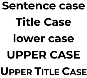
Commonly you have UPPER CASE, lowercase, Title Case, Sentence case, and what I like to call UPPER TITLE CASE. Generally, UPPERCASE is great in the video world. It bears the most impact for headlines and titles. It makes most efficient use of space. It brings all the letters into a consistent height so you can visually center the text in a field without worrying about those pesky descenders that fall below the baseline, like g, y, p, and j hanging off the edge. If you do need to show some paragraph text on screen (you don’t), a good font in Sentence case is most legible.

Don’t mess with the font
What I mean here is never squish it to make it fit. Keep the letters proportional to how they were designed. If you must change how much space the text covers left to right, you can adjust kerning or tracking to add or remove space between letters, but don’t do too much. A good font designer goes through a great deal of effort to optimize readability of their font and affecting its proportional shape throws all that benefit out the window. If you REALLY need to squeeze some content in, condensed styles of fonts have been created with readability optimization in mind.
Make it “Centered.”
Humans are weird. When we look at an object in a space, and that object is mathematically in true center of that space both vertically and horizontally, it often looks wrong. Most people find it would look slightly low. For a more balanced appearance, start off with the object in mathematical center, and push it just a few pixels higher. When you play with it a bit, I promise you’ll understand. Occasionally, the same can be said for left to right if that object has a strange balance to it itself. Don’t be afraid to push it around a bit after you lock it to center until it looks good!
More examples!
In example A, the logo has been placed in true mathematical center. When compared to example B, only pushed 20px higher (in a 1920×1080 field) than true center, you may be able to see that the logo is example B commands a little more presence over the field, and engages the entire field to feel slightly more balanced and strong. It might even feel like it’s more mathematically centered than example
A. You can see the labeled distances of the same examples below.
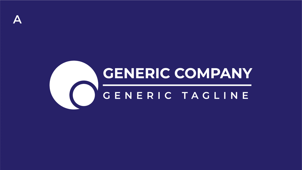
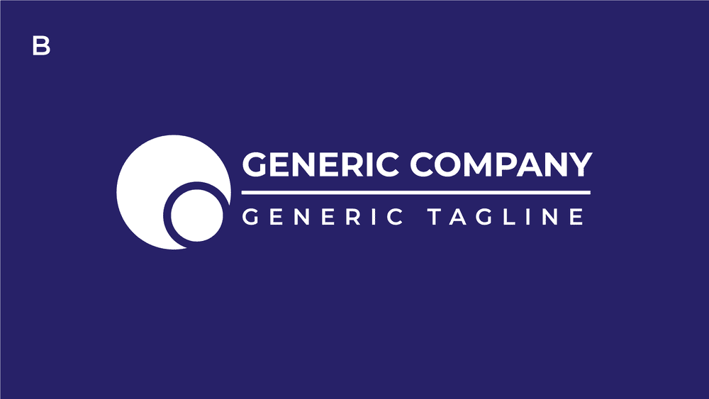
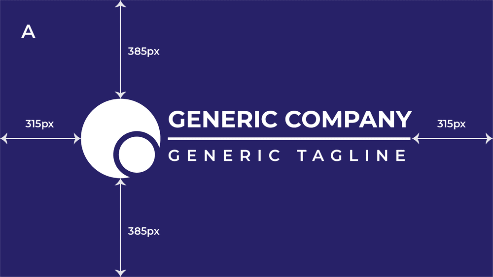
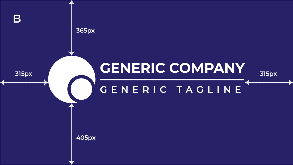
Here’s a bonus secret: even in this generic logo I drew just for this demonstration, the combined copy of “generic company” and “generic tagline” is not even mathematically center with the circles logo, but rather is pushed a few pixels high itself! Did you notice?
Thanks for Reading!
There is a vast amount of knowledge out there to consider in consistently making great visual design, and this has been just a tiny fleck in the sea of graphic design intended to get you thinking about it. Hopefully, you’ve found some new little tips to think about next time you have to push things around until they look good! If you have any doubts or just want a fresh set of eyes on your design, give us a shout and we’ll be glad to put our experience to use.
